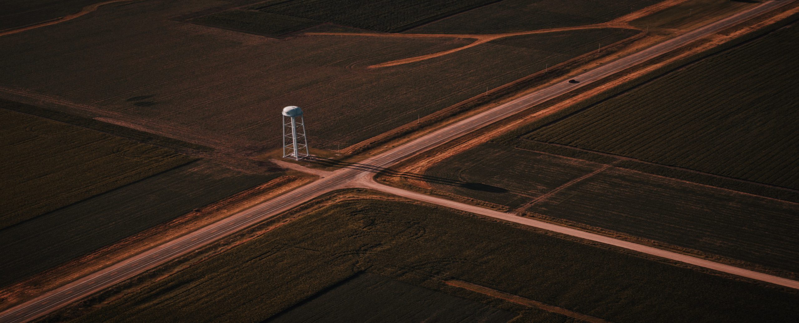
NDVI mapping: why maps are no longer enough for modern AgTech
NDVI mapping has become the default starting point for precision agriculture. Open almost any agtech platform today and you will find satellite imagery dashboards, color-coded vegetation maps, and NDVI images showing which fields are green and which are struggling. Access to this data is no longer a competitive advantage — it is table stakes.
And yet, despite this abundance of satellite imagery analysis tools, most agricultural operations are still making decisions the same way they always have: by looking at a map and relying on an agronomist’s gut feeling to interpret it.
That gap — between having a map and making a decision — is the defining challenge of modern agtech in 2026. The teams and platforms that close it will lead the next generation of precision agriculture. Those that do not will find themselves selling increasingly commoditized visualization tools in a market that has moved on.
This article breaks down what NDVI is, why it matters, and — more importantly — why it is no longer sufficient on its own. It then lays out a practical framework for what comes next: a multi-layer field intelligence model that turns satellite data into operational decisions.
Your fields generate data. Your platform isn’t connecting it.
What is NDVI? Understanding the index, the formula, and the imagery
Before we get into the limitations, it helps to understand exactly what we are working with.
NDVI full form is Normalized Difference Vegetation Index. NDVI meaning, in practical terms, is a numerical measure of how dense and healthy the vegetation in a given area is, derived from satellite or aerial sensor data.
The NDVI formula is straightforward:
NDVI = (NIR − Red) / (NIR + Red)
Where NIR is near-infrared light and Red is visible red light. Healthy, photosynthetically active vegetation absorbs red light and strongly reflects near-infrared light. Stressed or sparse vegetation does the opposite. The result is an NDVI index that runs on a scale from −1 to +1, where values above 0.5 typically indicate dense, healthy canopy and values approaching 0 or below suggest bare soil, water, or severely stressed crops.
NDVI imagery is generated by satellites — including Sentinel-2, Landsat, and various commercial platforms — that capture both red and NIR bands simultaneously. These are then processed into NDVI images: the familiar false-color maps where deep greens signal thriving crops and reds signal trouble. NDVI satellite imagery can be captured at resolutions as fine as 3–10 meters per pixel, updated as frequently as every 3–5 days depending on the platform and cloud cover.
For years, the availability of NDVI images was the hard part. Today it is not. The challenge has shifted entirely to what happens after you have the map.
The NDVI paradox: maps that show symptoms, not causes
Here is the core problem with NDVI mapping as a standalone product: it tells you that something is wrong, but not why.
A field showing a low NDVI index in the northeast corner could be experiencing drought stress. Or it could be a nutrient deficiency. Or compacted soil. Or a drainage issue. Or the aftermath of uneven fertilizer application three weeks ago. Or a late-season pest infestation. Or simply a shadow artifact from cloud cover at the time of the satellite pass.
The NDVI map looks identical in every one of those scenarios. The red zone is red. And that is where most agricultural software platforms leave the agronomist: staring at an NDVI image with a problem and no diagnosis.
Today, the majority of ag tools still operate this way. They show one data layer at a time. Cross-layer analysis — correlating the NDVI data with soil readings, weather history, or field operation records — is either manual, slow, or not supported at all. The platform delivers a map. The human does the rest.
This is not a visualization problem. No amount of sharper NDVI satellite imagery, better color palettes, or smoother map interfaces solves it. It is an intelligence problem. And solving it requires a fundamentally different architecture.
The multi-layer field intelligence model: moving beyond NDVI mapping
The shift from maps to decisions is not one step — it is a structural redesign of how agricultural data is collected, stored, and reasoned about. Instead of displaying one layer at a time, the next generation of agtech platforms combines multiple data streams into a unified field model.
Here is what that looks like in practice across five layers:
Layer 1 — Remote sensing (NDVI and beyond). NDVI imagery remains the first and most visible input. But in a multi-layer model, it is one signal among several — not the product itself. Platforms also ingest chlorophyll index, red edge bands, and NDRE (Normalized Difference Red Edge) alongside standard NDVI images to build a richer spectral picture of crop health.
Layer 2 — Soil and moisture data. Soil texture, organic matter content, pH, electrical conductivity, and soil moisture levels all interact directly with what shows up in NDVI mapping. A field zone with consistently low NDVI that also correlates with low organic matter and poor moisture retention is telling you something very specific — and very different from a zone with the same NDVI reading but adequate soil health metrics.
Layer 3 — Weather and anomaly data. Temperature extremes, precipitation deficits, wind events, and frost dates all create predictable signatures in NDVI satellite imagery — if you know when they happened. Correlating weather history with NDVI time-series data allows the system to distinguish between stress caused by drought and stress caused by root disease, for example.
Layer 4 — Field operations. When was the field planted? When were inputs applied, and at what rates? Were there any equipment issues that caused missed passes? Field operations logs provide the ground truth context that transforms an anomaly in the NDVI index from a mystery into an explainable event.
Layer 5 — Yield history and performance zones. Historical yield maps reveal the structural performance characteristics of every zone in a field. A low-NDVI zone that has always underperformed is a different problem — and a different investment decision — than a zone that typically performs well and is showing unusual stress this season.
When these five layers are combined into a single model and analyzed together, the result is something qualitatively different from any individual map. You are no longer looking at symptoms. You are looking at causes — and, more importantly, at what to do about them.
Your satellite, soil, and yield data are sitting in separate silos.
From “looks bad” to “here’s why and what to do next”
The practical output of a multi-layer field intelligence model is not a better-looking map. It is a decision.
Consider the difference between these two platform outputs for the same underperforming field zone:
Old approach: “NDVI map shows below-average vegetation index in the northwest quadrant.”
New approach: “Northwest quadrant shows NDVI index 0.31 versus field average of 0.62. Soil EC data indicates compaction in this zone. No rainfall in the past 18 days. Last nitrogen application missed this area due to equipment overlap error on May 3rd. Recommend targeted top-dress application within the next 5 days before forecast heat stress.”
The first output requires an expert to interpret it. The second output is the expert interpretation. That shift — from delivering satellite imagery analysis to delivering actionable intelligence — is the entire product thesis.
Building this kind of decision system requires anomaly detection across data layers, not just within them. It requires the platform to flag when a pattern in the NDVI imagery correlates meaningfully with a pattern in soil or weather data — and to suppress alerts when the correlation does not hold up. It requires a model of normal field behavior against which today’s conditions can be compared. And it requires that model to be field-specific, not generic.
This is where domain expertise and software architecture start to diverge from off-the-shelf agtech solutions — and where custom platform development begins to deliver durable competitive advantage.
Two real-world scenarios where multi-layer intelligence outperforms NDVI mapping alone
Scenario one: drought risk detection. A farm manager checks their NDVI map in early July and notices a slight decline across three fields. In a single-layer system, the appropriate response is unclear — is this normal seasonal variation or early stress? In a multi-layer model, the platform immediately correlates the NDVI trend with soil moisture sensor readings (which have fallen below field capacity for 11 days), weather forecast data (no rain predicted for 14 more days), and the yield history of these zones (which shows they are highly sensitive to moisture deficit). The output is a prioritized irrigation decision before the stress becomes visible damage — saving 15–20% of the yield that would otherwise have been lost.
Scenario two: nutrient deficiency diagnosis. NDVI satellite imagery shows yellowing in the mid-section of a field three weeks after planting. Standard interpretation: nitrogen deficiency, apply fertilizer. Multi-layer interpretation: the same zone shows high soil pH in the soil test records (uploaded at the start of the season), a history of iron deficiency in this specific area, and an NDVI time-series showing this pattern repeats every year at the same growth stage. The correct intervention is pH correction and micronutrient treatment — not more nitrogen. Without the cross-layer correlation, the wrong input gets applied, at cost, with no improvement in yield.
In both cases, the satellite imagery analysis was the starting point. The decision came from the model built on top of it.
The integration challenge: why data silos persist
If the solution is clear, why haven’t more platforms built it?
The honest answer is that integrating heterogeneous agricultural data is genuinely hard. NDVI mapping data typically lives in one platform. Soil test results live in spreadsheets or a lab portal. Weather data comes from a separate API. Field operations are logged in a farm management system that uses its own data schema. Yield maps may be stored in proprietary formats tied to specific equipment manufacturers.
Connecting these sources into a unified model requires data engineering work that most agtech platforms have not prioritized — because visualization tools are faster to build, easier to demo, and simpler to sell. The result is an industry full of platforms that are excellent at showing individual layers and poor at reasoning across them.
Breaking through this requires intentional architectural choices: API-first data pipelines, standardized field data schemas, and — crucially — the domain knowledge to know which correlations are agronomically meaningful and which are noise. Satellite imagery analysis at scale is a solved problem. Multi-source agricultural intelligence is not. That gap is exactly where differentiated platforms are being built right now.
Building vs. buying: a strategic question for agribusinesses
For agribusinesses and product teams evaluating whether to build a custom multi-layer intelligence platform or integrate an off-the-shelf solution, the question is not which approach is technically superior — it is which approach creates lasting competitive differentiation in your specific context.
Off-the-shelf platforms offer speed to market, lower upfront investment, and continuous vendor-side development. For teams that need basic NDVI mapping capabilities quickly, this is often the right starting point.
Custom architecture delivers something different: a system shaped around your specific crops, geographies, data sources, and operational workflows. When the competitive advantage lies in how you use field data — not just whether you have it — custom development pays for itself in the decisions it enables.
The most effective teams in precision agriculture today are not choosing between maps and intelligence. They are building the infrastructure to make the transition from one to the other — and doing it before their competitors realize the question has changed.

Conclusion: ndvi mapping is the beginning, not the end
NDVI mapping changed agriculture. Making vegetation health visible from orbit — affordably, at scale, updated every few days — gave the industry a foundation for data-driven decision-making that simply did not exist a generation ago.
But the opportunity has moved. NDVI imagery is now the starting point of a field intelligence workflow, not its conclusion. The teams building for 2026 and beyond are the ones asking what the NDVI index correlates with — not just what it shows.
If you are building or scaling an agtech platform, modernizing an internal agriculture system, or evaluating how to close the gap between the satellite data you already have and the operational decisions you actually need, that is precisely where domain expertise and custom software architecture start to matter. The map got you here. The model will take you forward.